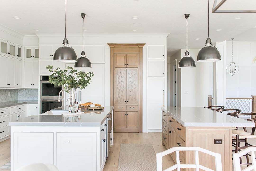
We love working with all of our clients. But a recent remodel project on a house for a large family who are also animal lovers was especially fun and rewarding.
The renovation project had multiple components. The first part that we had to tackle was uniting several adjacent areas on the first floor – the entry way, the kitchen and living areas, and the hallway – all of which had a very different floor finish.
The entryway was covered with black polished granite tile, the hallway was done in hardwood, and the living area and kitchen floors were covered with a grey ceramic tile. The homeowners love the look of natural stone, so we decided to go with a large format porcelain tile with beautiful soft veining for all of these areas.
Porcelain tile is highly resistant to wear and tear and it works great for high traffic areas like kitchens and entryways. As opposed to wood, porcelain tile isn’t as easily damaged from animal claws. Installing the porcelain tiles made a huge difference in how the first floor looked. Without the floor transitions, the space looks bigger and the open layout has a better flow.
In the entryway, we also removed archways to open up the view. That added more natural light to the area. In the living room, the owners wanted to go with white walls, but they chose to add some interesting pattern designs on select walls.
We accomplished this by using a beautiful gold, grey and white-patterned tile. We installed it from the floor to the ceiling around the fireplace and also around a newly designed wet bar in the same room. The change modernized the space and made it feel more open and lighter.
The kitchen, a very important room for the family that loves to cook and gather around the kitchen island, also underwent a major transformation. We ended up changing the layout quite a bit to improve the room’s flow, to gain more storage space and to create a more comfortable and collaborative cooking experience for the owners.
The most important part of the kitchen, the cooktop, was on the kitchen’s small island that had been built in the middle of the room without a proper ventilation. The existing kitchen had a downdraft hood. A downdraft hood is a cooker hood fitted into a kitchen countertop. They’re most often used on kitchen islands. But, we typically don’t like to use downdraft hoods, and especially in kitchens that get used a lot.
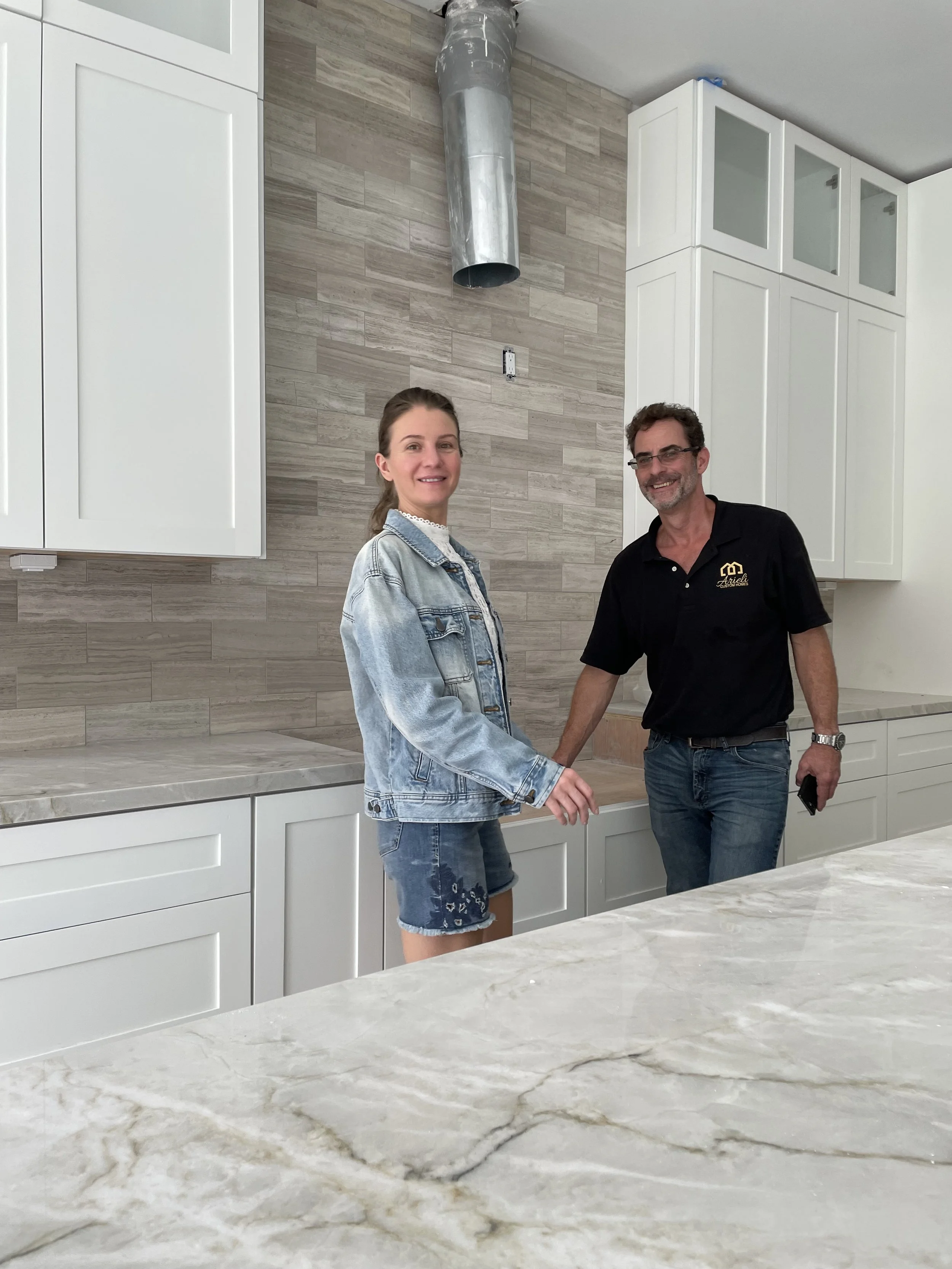
So instead, we designed a kitchen with a wall hood. We found a way to run a 10” pipe up through two floors of an as-built house – a challenging feat. We surrounded the wall hood with cabinets up to the ceiling for maximum storage. Glass doors at the top added a nice element of visual interest.
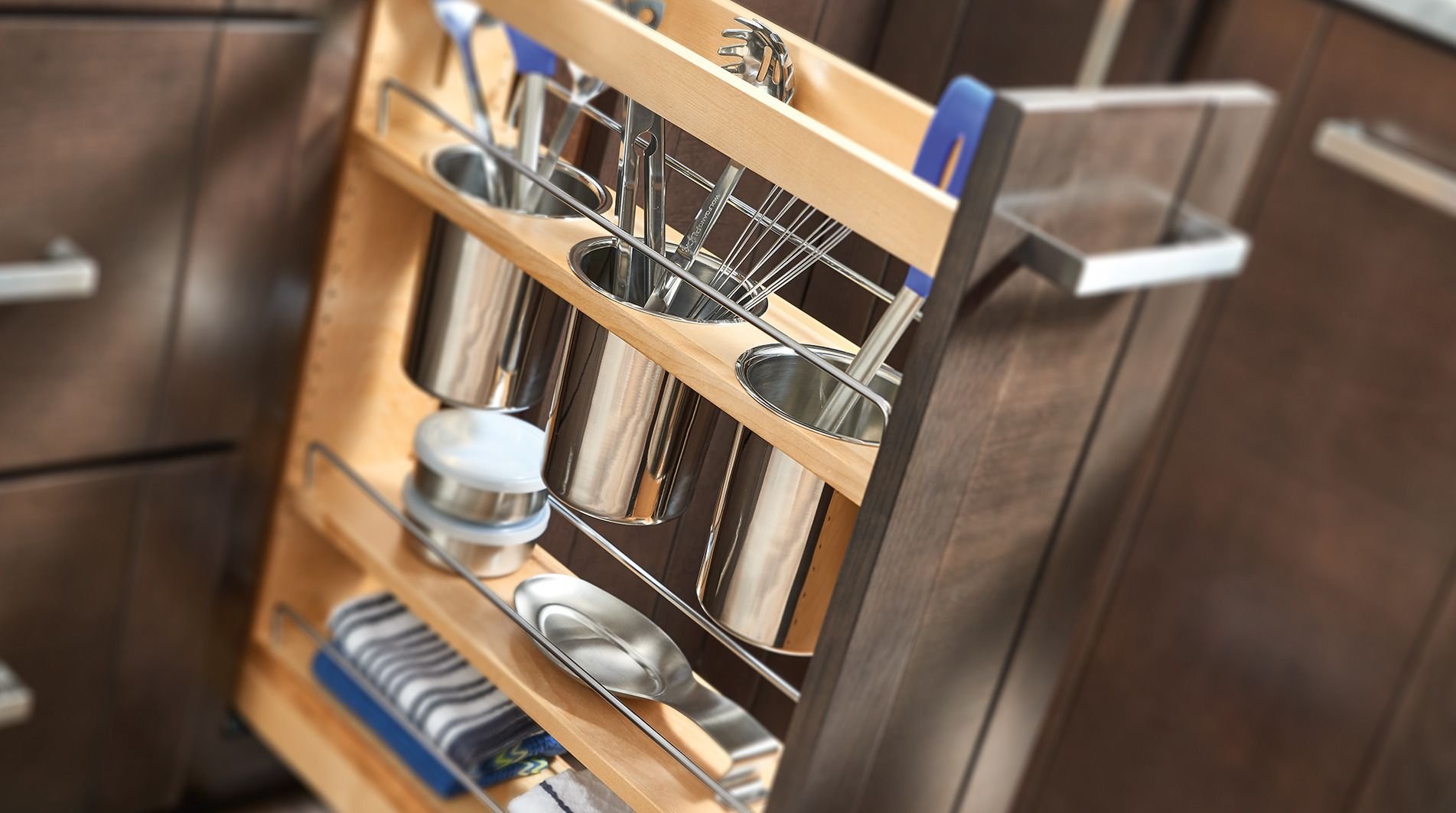
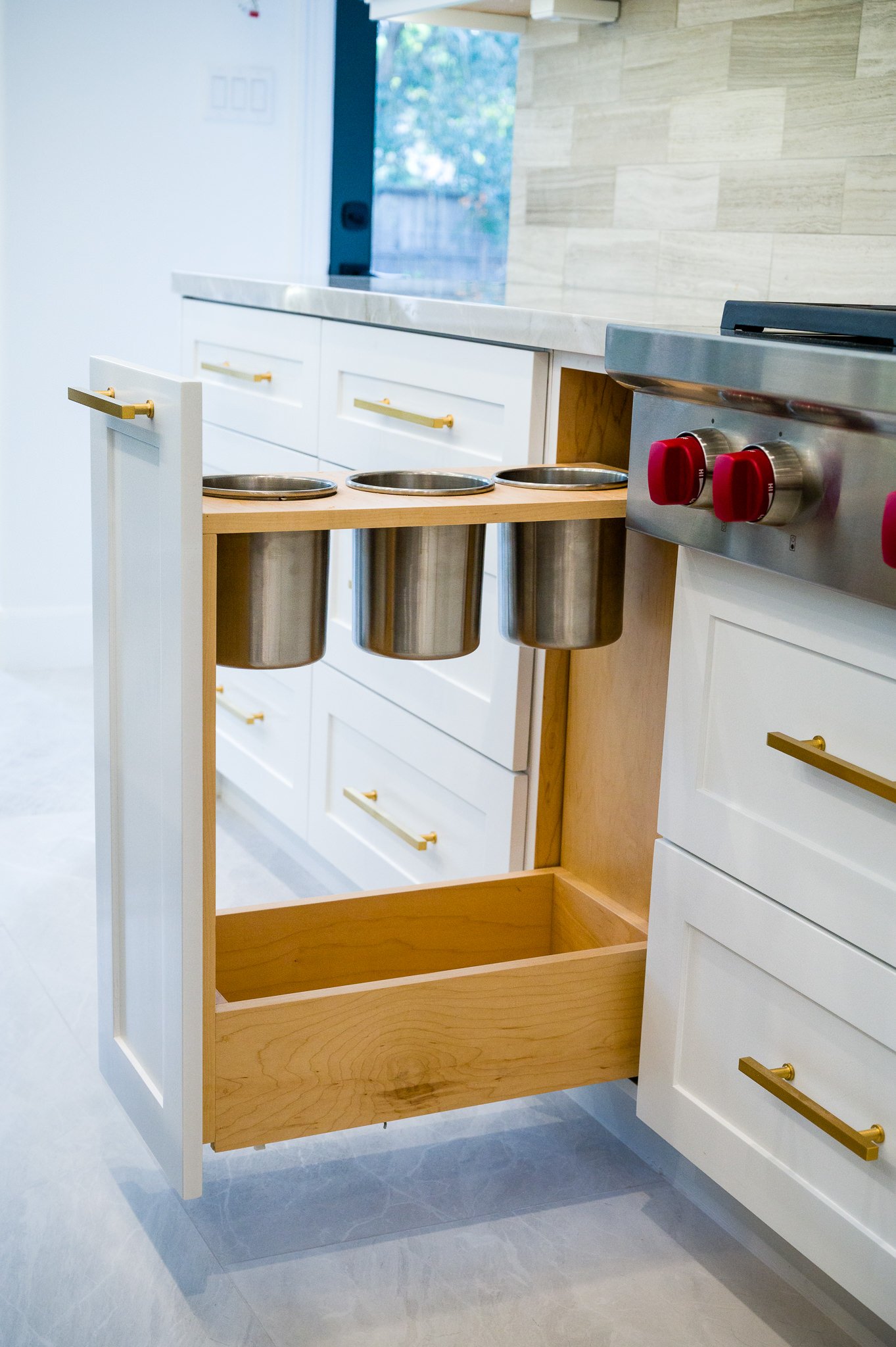
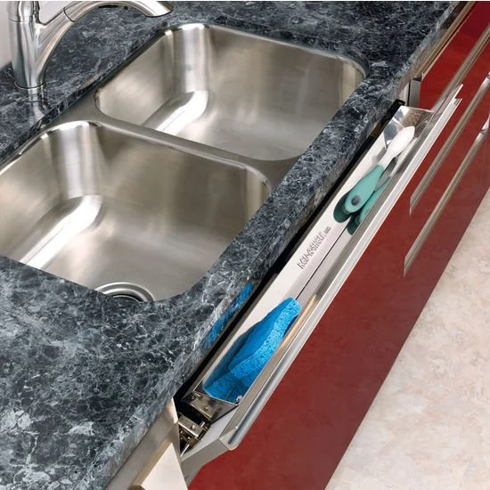
We moved the fridge to the opposite side of the kitchen to give the owners more space around the appliance. It’s always better to have more space around a refrigerator so the doors can move freely without blocking kitchen traffic. Finally, we integrated kitchen organizers like pullouts with utensil bins, an appliance pull out, a spice pullout organizer and more into the kitchen to make the space more functional than it had ever been.

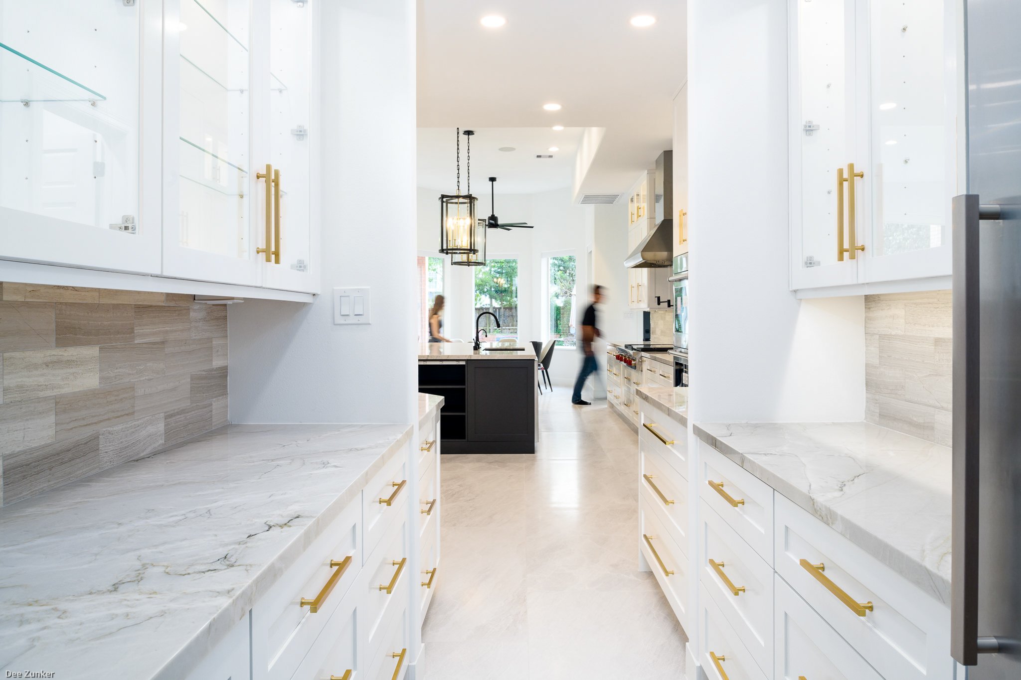


Before our renovation, the kitchen looked dark, especially with the black granite backsplash and countertops. Keeping in mind how much the owners like natural stone, we replaced the backsplash and countertops with Mont Blanc quartzite slabs and Athens silver cream marble backsplash tile.
In the end, we accomplished all of our client’s goals. We created a better flow in the home’s entryway, living room and kitchen areas, we added more storage, and we updated the previously outdated look of their home. Our clients are thrilled with the results and they’ve been enjoying their new spaces cooking and socializing with family and friends.


