Design

From Driveway to Flooring: Making a Home More Wheelchair Friendly

Part 1 of 2

“A design isn’t finished until somebody is using it.” — Brenda Laurel, Scholar, Author and Researcher

Modifications that make homes more accessible help people with disabilities live more independently, and that’s especially true for the around 2.7 million people in the U.S. who use a wheelchair.

In recent years, developments in technology have made it possible for builders to incorporate more automation into home modifications. But less hi-tech modifications to make sure wheelchairs can easily navigate through a home are crucial. These need to be well thought out if they’re going to be successful.

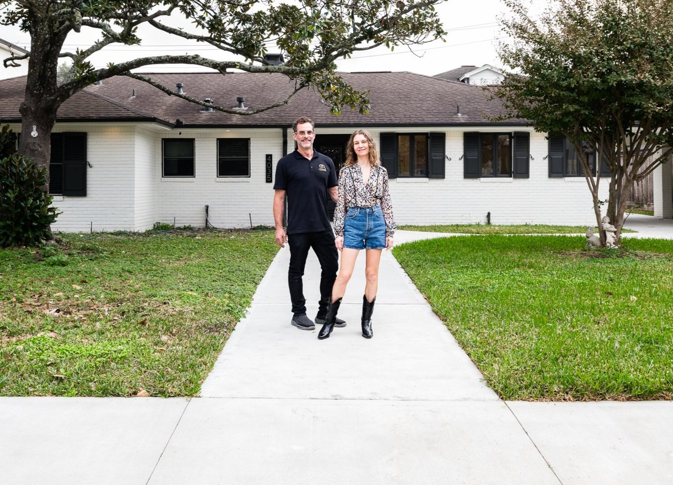
During a recent full-scale remodel, we incorporated accessible features into a home to make it more wheelchair friendly. The one-story house was built in 1940s with a traditional closed floor plan. It needed updating. But the bulk of the remodel focused on incorporating specialty items and automation into the design and making sure counters and fixtures were set at appropriate heights and locations for the homeowners.

The one-story house was built in 1940s with a traditional closed floor plan.

We started by addressing the home’s exterior and driveway to make them more wheelchair friendly. Then, we addressed doors—both interior and exterior—modified the floor plan, streamlined flooring and made modifications to the kitchen and primary bathroom.

A more welcoming entrance

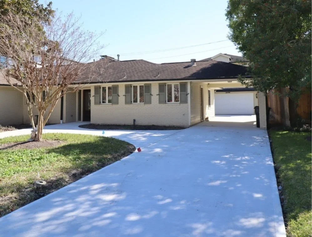
The existing home had a narrow path to the front door and the brick driveway was bumpy and uneven. We redesigned the flatwork in front of the house to create a wider path to the front door. We also took out stepping stone path from the main driveway to the front entrance and made it concrete instead so the wheelchair can easily navigate it.

At the end of the driveway where it meets the street, there was a small ditch to collect water. The owner couldn’t safely pass over it in his wheelchair, so we added a steel cover. We used treadplate on it to make for better traction when cars pull into the drive.

This took planning because we didn’t want to impede the flow of rainwater. We used self-leveling sealant to create a smooth transition from the driveway to the ditch cover to the street. Now, the owner can successfully navigate by himself from the street up the driveway and into the house.

We added a steel cover over a ditch. Now, the owner can successfully navigate by himself from the street up the driveway and into the house.

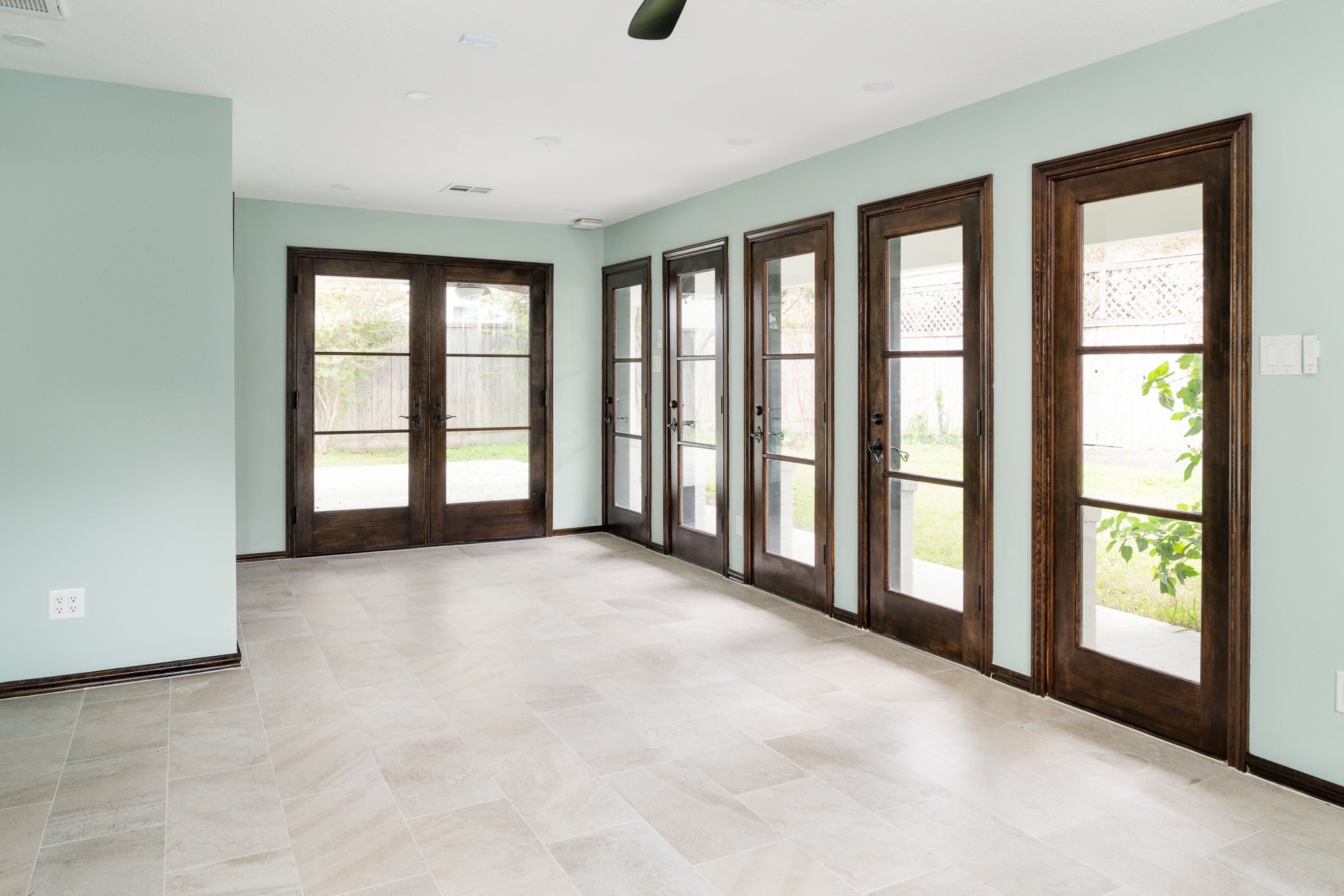
Out back, we created a flat, even patio area that connects to the house with new double doors. To keep water from entering the home through the patio we used stainless steel flashing with a drip edge. We installed it under the bottom skirt of siding, sealing off the first 18 inches from the ground to keep water from damaging the walls.

ADA-accessible doors

We wanted to make sure every entrance to the house, plus interior doors, were accessible. Almost all doors we used were at least 36 inches wide and double doors to make it more seamless to pass through in a wheelchair.

For exterior doors, we installed beautiful Jeld Wen Multi Lock door sets with a stain grade wood interior and ADA thresholds. Door thresholds refer to the material on the floor inside a doorframe that helps ensure an air-tight fit between the floor and bottom of the door. ADA thresholds are lower—they must be almost flat with the floor, but high enough so water can’t seep through. To ensure water doesn’t make its way into the house, we also had custom door pans made for the new exterior doors to drive water out and away from the house.

For exterior doors, we installed beautiful Jeld Wen Multi Lock door sets with a stain grade wood interior and ADA thresholds.

We added pocket doors throughout the house, an option we liked because they don’t require door stops to hold them open or get in the way of other nearby opened doors. With one, we did away with the typical stops and trims you normally see on the insides of pocket door frames so we could recoup 3/4 inches in a tight space. The modification will save money on future repairs due to what would have been inevitable damage from the wheelchair navigating the small space.

An open floor plan

While the openings between the kitchen, living and dining spaces were all wide enough to be ADA compliant, we wanted to open up the space even more for ease of movement.

This modification gave the homeowner more options when it comes to furniture placement and to creating easy to navigate paths around furniture and easy access to furniture.

As with all remodels, opening up walls and adding beams to make sure the home was still structurally sound meant multiple systems needed to be rerouted. This included water pipes, gas pipes, electrical wiring and HVAC drain lines. It was time-intensive work that had to be completed well before the framer, drywaller and painter got involved and required careful planning and coordination.

Seamless flooring transitions

The house still had its original, traditional two-inch select white oak flooring throughout, except for in the kitchen, gym (the former den) and in the bathrooms. We wanted to make sure flooring was even and made for easy transitions in the wheelchair.

We installed new tile in the gym and made it perfectly flush with the wood floor in the living room. We used a thin metal flush transition piece to separate the tiles from the wood. Color-matched flexible sealant filled in final gaps.

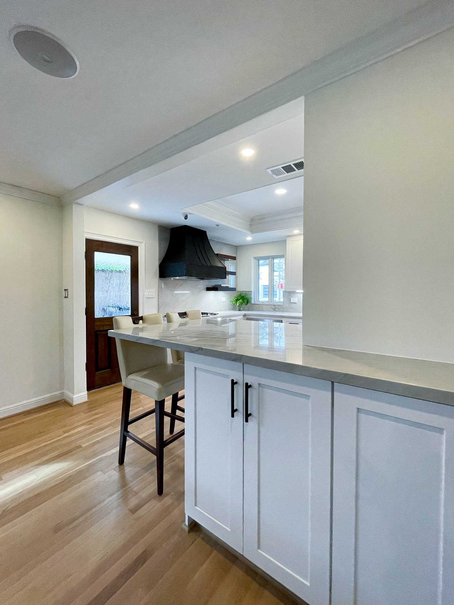
In the kitchen, we removed the tile and installed matching wood. We found reclaimed wood, matching the wood species, grade and manufacturer. We used the “tar and screeds” method to put in the floor, first laying tar, then thin wood planks, or screeds, followed by the flooring. We were able to lay the wood perfectly flush and in line with the rest of the home. Transitions between all rooms were seamless, with most not requiring any thresholds or transition strips to bridge gaps.

Stay tuned for Part 2 of this blog where delve into modifications made in specific rooms and automations.

10 steps to transforming a small bathroom on a budget

From tooth brushing and face washing to luxuriating in a long shower, most homeowners spend a significant amount of time in the bathroom. For many, it’s a sanctuary. One survey found two in five homeowners rest and relax in their bathroom.

We love helping transform outdated bathrooms into spa-like oases. A recent project helping a young family of four revitalize their small and inefficient primary bathroom was especially rewarding and everyone was pleased with the end result.

The owners’ existing bathroom felt closed off, dark and claustrophobic. It had a small shower with an unnecessary step-up at the entrance and an oversized tub on a raised platform toward the back. Designers often like to make a tub the focal point of a bathroom. But, in this case, it looked like the tub was added as an afterthought.

The bathroom also didn’t give the owners adequate storage, and having only one sink in the room created traffic congestion in the morning when everyone was getting ready for their day. The bathroom needed a major change. We planned to give it a completely new layout, and we started the total remodel by gutting the small room.

Here’s how we approached the small bathroom remodel, which our client needed to be done on a tight budget. As Don Draper from the TV show “Mad Men” likes to say, we wanted to “Make it simple, but significant.”

1.     Planning it all out. We started by creating a new bathroom layout. The owners didn’t use the tub at all, so we decided to get rid of it and instead put a larger shower in the room. By removing the old shower from the entry way, we opened up the space and then had room for a nice linen closet by the entrance. 

We wanted to hide the toilet so it wasn’t the first item seen when entering the room. We found the perfect place—in between the linen closet and the shower. That way, we could fit a double vanity in place of the prior single vanity and toilet. There was also a space in the wall behind the toilet we could use for storage. We found the previous contractor made the wall thick enough to accommodate a storage space. We used mosaic tile and put it in the middle of the space.

Since we were working with a small space with almost no natural light, we chose bright colors for the room. Knowing the tight budget, as we picked materials, we found wholesale items and items on clearance at warehouses that worked well.

Arieli Custom Homes Bathroom Remodel Ideas

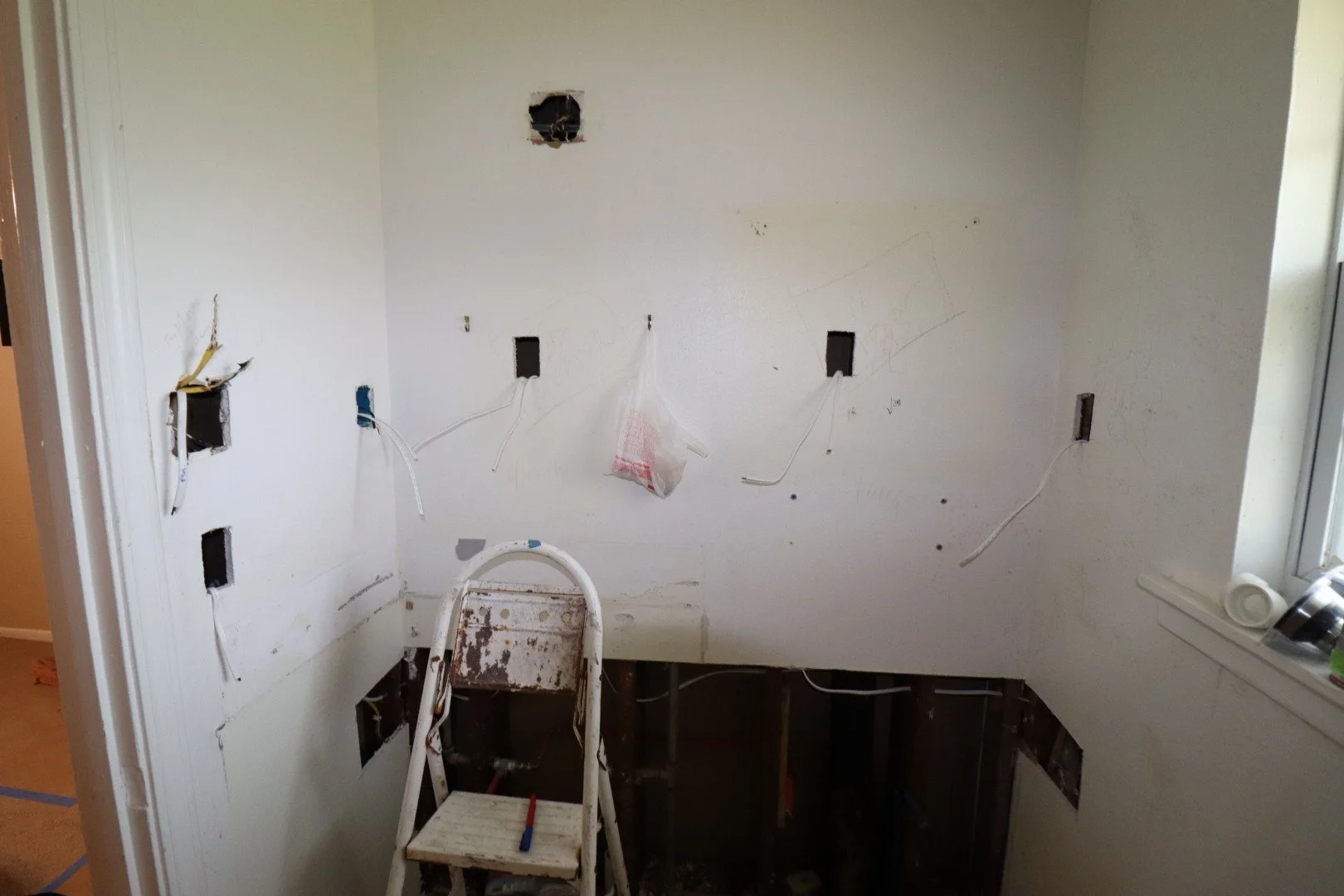
2.    Demolishing the old bathroom. We ripped out everything in the room—including the elevation differences and stepsleaving only the walls.

3.    Making the plumbing adjustments. Since we moved the toilet and shower and added another sink, we needed some substantial plumbing work in the bathroom. The house is slab on grade, so we had to cut through the slab and back porch concrete deck, onto which the previous contractor had extended the bathroom.

4.    Doing the electrical work. We like layering lighting and believe the more options, the better. We added LED panel lights on the ceiling and installed LED lighted vanity mirrors above each sink.

5.    Covering the walls. We replaced all the old insulation and sealed the exterior walls with Polyseal. In the shower area, we added a new shower pan, per code, and covered the shower walls with 1/4" cement board sealed with a waterproofing membrane. We built the bench from CMU blocks and cement and sealed it, too, with the waterproofing membrane.

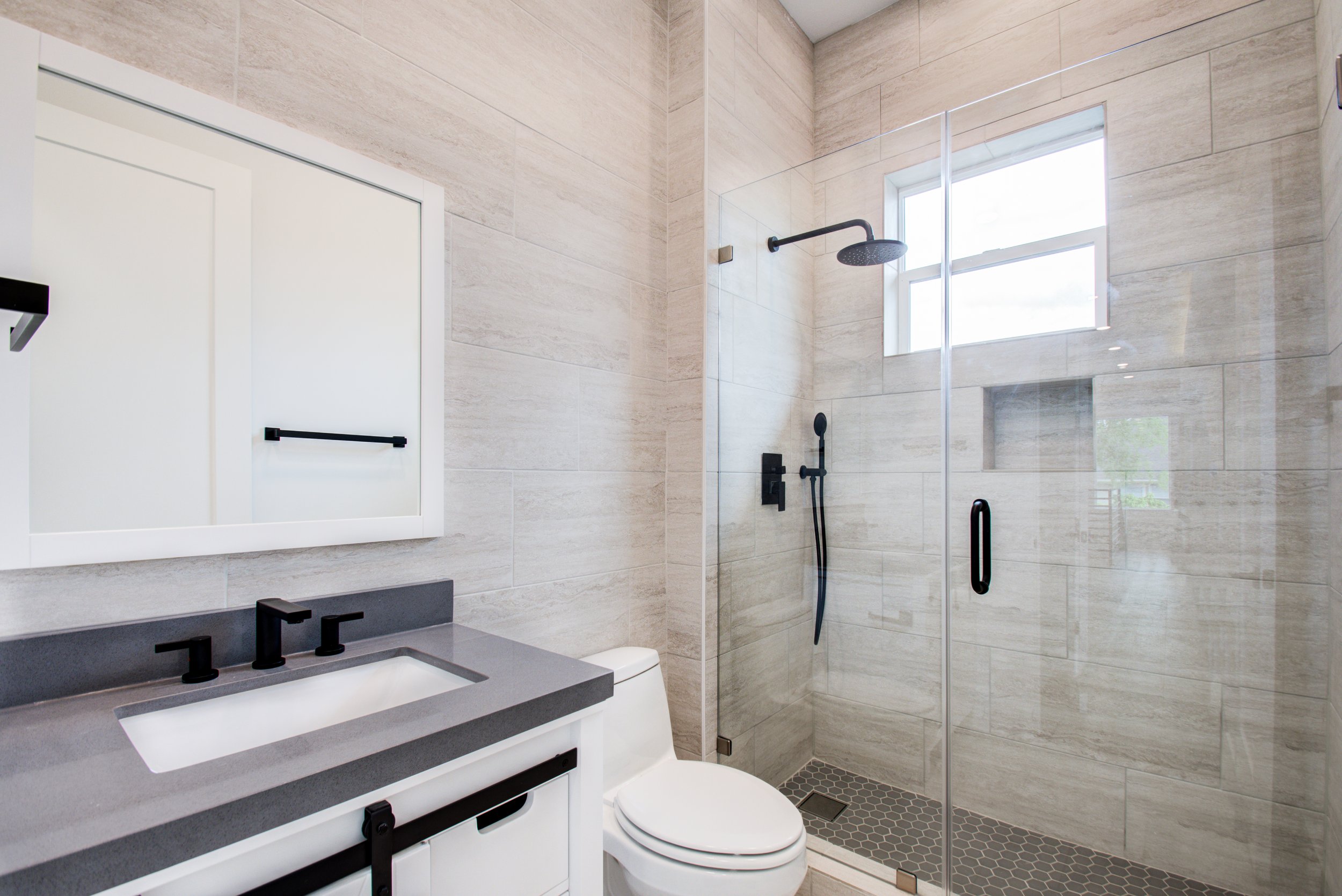
6.    Installing the tile. For the shower walls and bathroom floor, we chose a 12x24 porcelain tile. For the shower floor, and as an accent tile, we found a beautiful marble mosaic to add some texture. On the vanity wall, we used a 3x9 gloss subway ceramic tile with a gentle texture. A tile like this reflects more light than a matte finish and it has the effect of adding more brightness to a space.

7.    Painting the room. We chose to use SW7009 Pearly White for walls. This creamy white paint helped add some warmth to the space. We chose other design elements, such as cabinet hardware and finish of vanity faucets in satin nickel (a warm-toned silver), for the same reason.

8.    Putting up the shower glass. The previous shower had a traditional framed design that didn’t let much light pass through. We installed a frameless modern shower glass that goes great with the look of the new bathroom. It’s also glass treated to prevent water spots. 

9.    Trim out. In this last phase of electrical work in which plugs, switches and light fixtures are installed, we decided to install a humidity sensitive exhaust fan (with a built-in night light) and LED panel lights. A good place for the fan is on the ceiling between the toilet and shower.

10.   Finishes. We liked a deep blue vanity to add some color to the mostly white and gray of the new design. The vanity has a bright quartz countertop that goes beautifully with all other elements. Adding black shower fixtures and a heated towel rack complemented the dark color of the vanity and made the design look cohesive and finished. With Houston’s high humidity, we also included a heated towel rack that helps with faster drying.

In the end, our clients were thrilled with the bathroom results and they’ve been enjoying their time in their new bright, open space.

Why showers are replacing tubs

People bathed in bathtubs until modern plumbing made it possible for the most U.S. homes to have a shower starting around the 1920s. Since then, we’ve seen trends come and go when it comes to bathtubs and showers in home bathrooms.

For many, a large soaking tub has been–and still is—the hallmark of an upscale master bathroom. But, overall, homeowners tend to use their shower more than their bath. A recent study also found online searches for walk-in showers surged by 100%. At Arieli, we’ve seen signs that showers may be replacing tubs. We’ve had clients ask us to scrap the bathtub in their bathroom and install a larger shower instead.

While a long soak in a deep soaking tub can be a relaxing end to a long day, there are many compelling reasons for showers to completely replace tubs in the modern home. A large, luxury shower can be just as satisfying and elegant.

Here are six reasons to consider including showers in your new custom home design or replacing a tub with a luxury shower during your home renovation.

1) Showers are more accessible. Getting in and out of a shower is much easier than a bath tub. So, if you have someone in your home who has a disability or who’s older and less mobile, a larger shower might be a good option. Showers can be built so they’re walk-in, with no ledges to step over. You can also add customized built-in benches, grab bars and even non-slip tiles.

showers might be on their way to replacing tubs. Arieli Custom Homes

2) Showers are quick and convenient. Nothing beats a shower when you need to wash your body quickly. You don’t have to wait for the water to warm up and then an entire tub to fill. Simply hop in, soap up and rinse off. This is a good option if, because of your lifestyle – maybe you’re an athlete or you exercise often – you find yourself bathing very frequently.

3) You can conserve water with a shower. Showers only use around two-thirds the amount of water of baths if you take a quick shower, around 10-15 gallons versus up to 70 gallons. With showers, you can control the amount of water you’re using based on the fixture you use. Some fixtures are made with water conservation in mind. You can also try taking a Navy shower, or a way of showering where you conserve water by turning off the faucet while you soap up your hair and body.

4) Cleaning a shower is easier. It’s easy for dirt and dead cells to stick to the walls of a soaking tub, building up grime that you have to spend time and muscle scrubbing off. A shower can be easier to both clean and maintain. Steam is a great tool to loosen dirt on shower walls. If you squeegee after every shower and turn on the fan in the bathroom, you’ll help keep mold at bay and regular cleaning will be simpler.

5) Your body after showering may be cleaner, too. When you shower, the dirt and dead cells you scrub off your body flow down and out the shower drain. The water pressure can also help get the dirt off of your skin. However, when you clean yourself in a soaking tub, anything that you scrub off your body sticks around with you in the tub until you’re done and you drain the tub.

6) A shower can be luxurious, too. A shower can be a relaxing spa-like experience, too, depending on the design and the various features you choose to install. Start with beautiful tiling, and then add features like custom benches, rain showers, or a steam option. More companies are also now making products to use in the shower to make it just as indulgent as a long soak in a bathtub.

After replacing our clients’ tubs with large, luxurious showers, we’re growing more convinced that showers might be on their way to replacing tubs. However, as you plan your custom home or think about how to renovate your current one, keep in mind that having at least one bathtub in your house is probably a good idea when it comes to resale value.

Showers only in a home might be okay if, when you’re ready to sell, you attract elderly buyers or a couple that doesn’t plan to have kids. But if a family with young kids, or a couple with a child on the way, is interested in buying your home, they’ll likely want a bathtub, and not having at least one could turn your potential buyer away.

Why showers are replacing tubs.

Living Space and Kitchen Transformation

We love working with all of our clients. But a recent remodel project on a house for a large family who are also animal lovers was especially fun and rewarding.

The renovation project had multiple components. The first part that we had to tackle was uniting several adjacent areas on the first floor – the entry way, the kitchen and living areas, and the hallway – all of which had a very different floor finish.

The entryway was covered with black polished granite tile, the hallway was done in hardwood, and the living area and kitchen floors were covered with a grey ceramic tile. The homeowners love the look of natural stone, so we decided to go with a large format porcelain tile with beautiful soft veining for all of these areas.

Porcelain tile is highly resistant to wear and tear and it works great for high traffic areas like kitchens and entryways. As opposed to wood, porcelain tile isn’t as easily damaged from animal claws. Installing the porcelain tiles made a huge difference in how the first floor looked. Without the floor transitions, the space looks bigger and the open layout has a better flow.

In the entryway, we also removed archways to open up the view. That added more natural light to the area. In the living room, the owners wanted to go with white walls, but they chose to add some interesting pattern designs on select walls.

We accomplished this by using a beautiful gold, grey and white-patterned tile. We installed it from the floor to the ceiling around the fireplace and also around a newly designed wet bar in the same room. The change modernized the space and made it feel more open and lighter.

The kitchen, a very important room for the family that loves to cook and gather around the kitchen island, also underwent a major transformation. We ended up changing the layout quite a bit to improve the room’s flow, to gain more storage space and to create a more comfortable and collaborative cooking experience for the owners.  

The most important part of the kitchen, the cooktop, was on the kitchen’s small island that had been built in the middle of the room without a proper ventilation. The existing kitchen had a downdraft hood. A downdraft hood is a cooker hood fitted into a kitchen countertop. They’re most often used on kitchen islands. But, we typically don’t like to use downdraft hoods, and especially in kitchens that get used a lot.

So instead, we designed a kitchen with a wall hood. We found a way to run a 10” pipe up through two floors of an as-built house – a challenging feat. We surrounded the wall hood with cabinets up to the ceiling for maximum storage. Glass doors at the top added a nice element of visual interest.

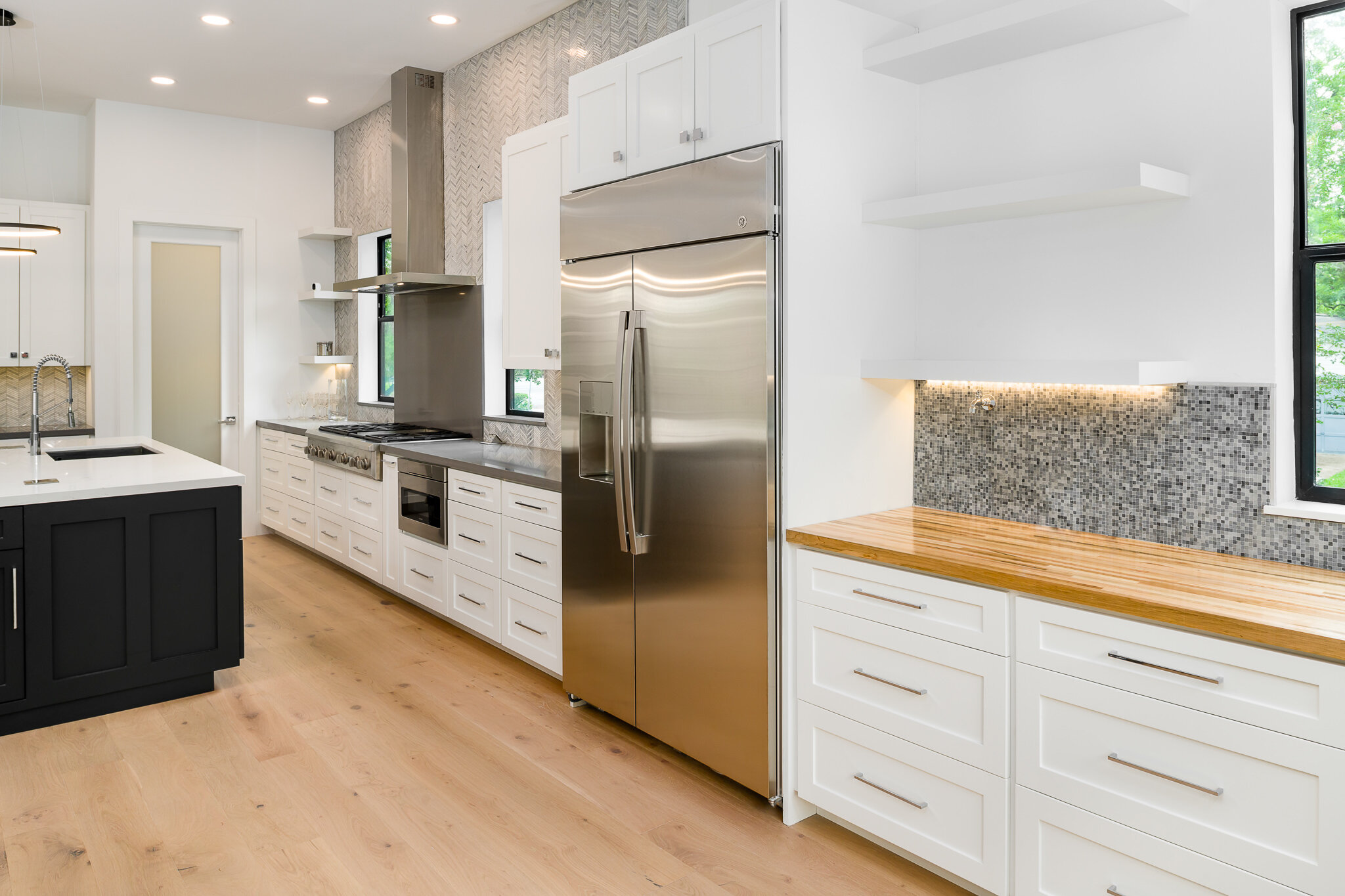
We moved the fridge to the opposite side of the kitchen to give the owners more space around the appliance. It’s always better to have more space around a refrigerator so the doors can move freely without blocking kitchen traffic. Finally, we integrated kitchen organizers like pullouts with utensil bins, an appliance pull out, a spice pullout organizer and more into the kitchen to make the space more functional than it had ever been.

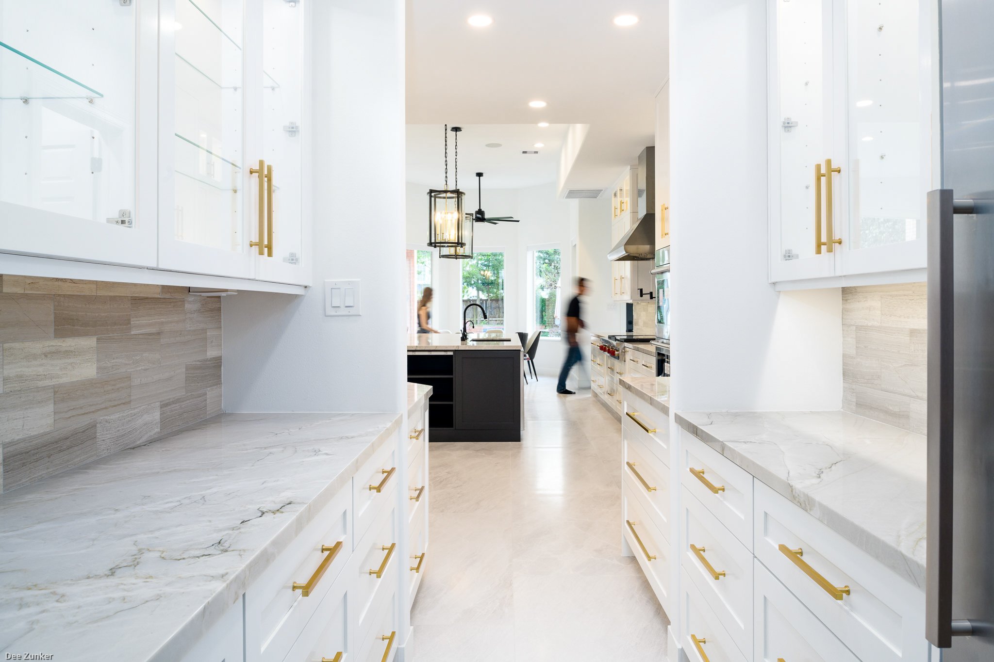
Before our renovation, the kitchen looked dark, especially with the black granite backsplash and countertops. Keeping in mind how much the owners like natural stone, we replaced the backsplash and countertops with Mont Blanc quartzite slabs and Athens silver cream marble backsplash tile.

In the end, we accomplished all of our client’s goals. We created a better flow in the home’s entryway, living room and kitchen areas, we added more storage, and we updated the previously outdated look of their home. Our clients are thrilled with the results and they’ve been enjoying their new spaces cooking and socializing with family and friends.

Top 6 kitchen organizers we like

To make the most of your custom home kitchen and enjoy the time you spend there, you want a well-designed, functional space. An organized kitchen that makes use of built-in kitchen organizers will save you time, it’s easier to clean, and you may find yourself cooking more than you have in the past.

Arieli Custom Homes Remodel Project

During custom home builds, or as we’re remodeling an existing home, we design kitchens first and foremost with ease and efficiency in mind. Part of what makes a kitchen more efficient is seamlessly incorporating several types of built-in kitchen organizers into the design.

Built-in kitchen organizers often give you more countertop space and a clean, contemporary look. They also complement other non-built-in kitchen organizers you may want to incorporate into your space to make it even more efficient.

Here are the top six kitchen organizers we love to integrate into our kitchen designs:

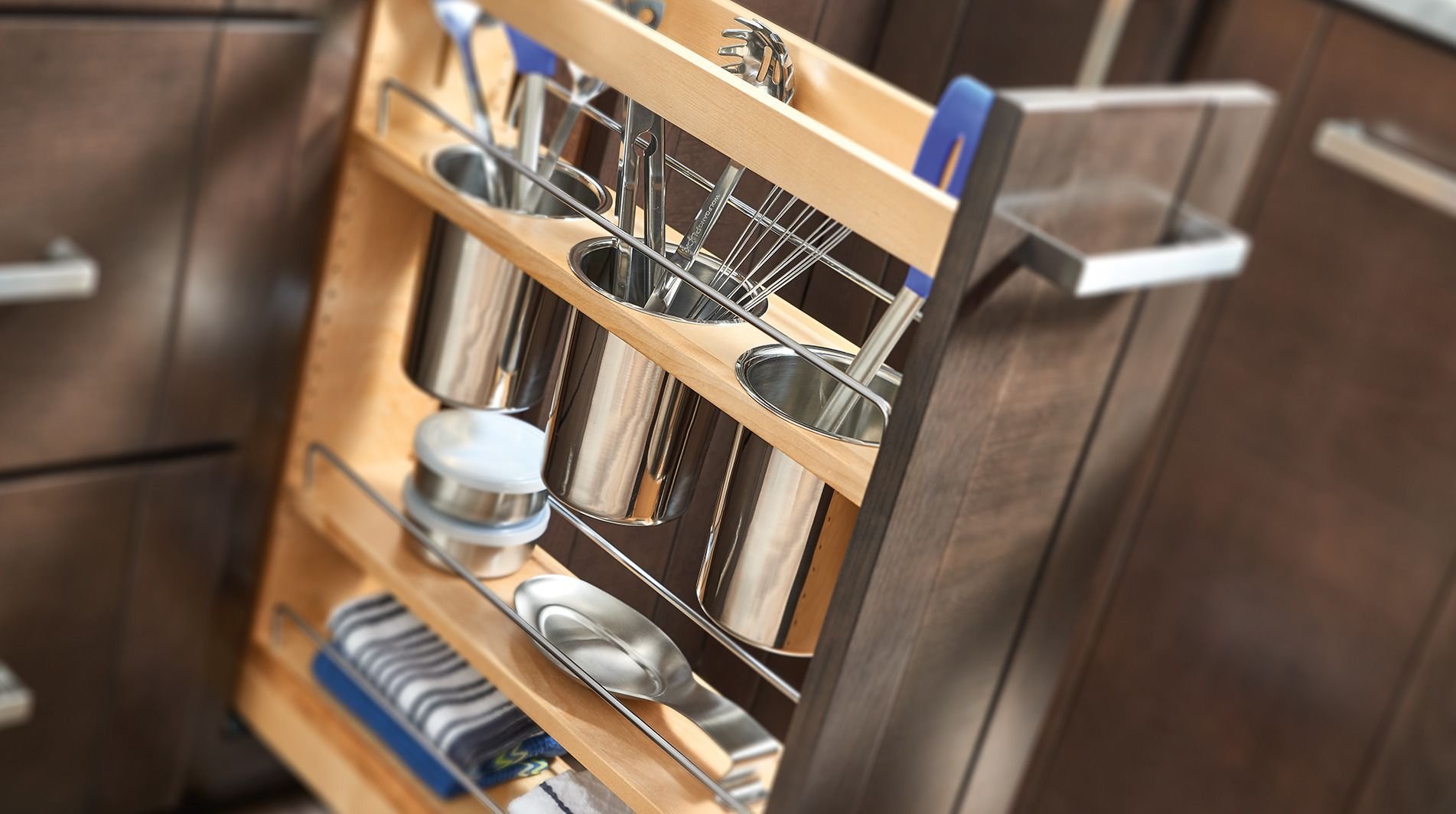
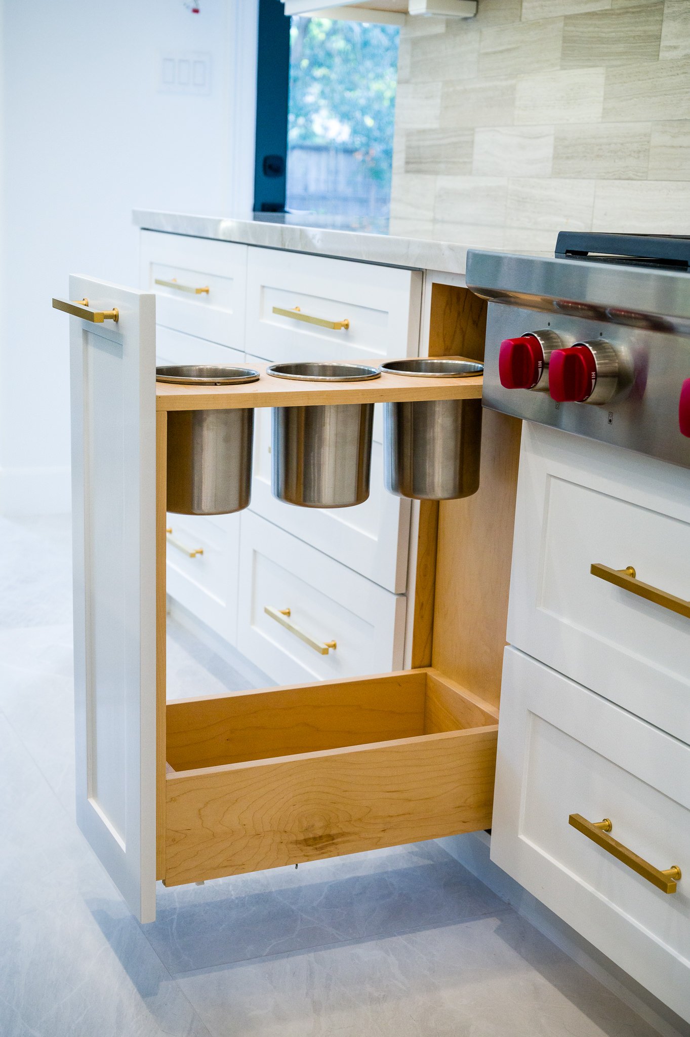
1) A cabinet pullout with utensil bins. This type of kitchen organizer is typically a tall, skinny drawer that’s used to store cooking and serving utensils. It’s an organized, clean-looking alternative to keeping your cooking utensils in bins or ceramic containers on the countertop or shoving them into a large drawer where they often get lost. One level of the cabinet pullout usually contains round holes that bins are slipped into so you can store your utensils upright.

We like to install this type of kitchen organizer close to the range or cooktop for easy reach and convenience.

2) An appliance lift. An appliance lift is a great option for heavy appliances you don’t use very often, like a heavy duty mixer, a large ice cream maker or a bread maker.  It saves countertop space and it’s a good option for minimalistic kitchens. With an appliance lift, you store your mixer or bread maker inside a bottom cabinet on a shelf that’s connected to hinges.

When you’re ready to use the appliance, you pull the shelf with your appliance on top out and up, and the shelf locks in place as you use it. Then, you store it back inside your bottom cabinet when you’re done.

3) Paper towel holder. Instead of keeping your paper towels on a freestanding paper towel holder that takes up valuable counter space, we like to install built-in paper towel holder out of the way. Built in paper towel holders can be installed under the counter or in a drawer.

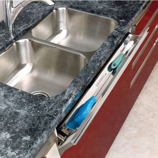
4) A sink front tip out tray. These trays directly in front of your kitchen sink are an excellent use of otherwise wasted space and they help to keep your sink area looking uncluttered. Sink front tip out trays are used in place of false drawer fronts under a sink, and they hide small items like your sponges, rags and scrub brushes.

5) An under-sink pull out bottom shelf. Sink plumbing and a disposal often don’t leave much storage space under the kitchen sink, but you can still effectively use the space you have by installing a pull out shelf on the bottom of the cabinet. This type of kitchen organizer makes it easier to access the soaps, cleaning products and dishwasher detergent tablets you store under your kitchen sink. The best type of shelf is either a pre-bought or a custom-made simple wire or wood shelf attached to metal tracks.

6) Lazy Susan. Maximizing storage space in the kitchen is always important, and that’s especially true when it comes to smaller spaces. Installing a Lazy Susan in corner cabinets is an excellent way to utilize blind corners and it gives you overall more storage for your pots, pans and other kitchen items. Design and prices of Lazy Susans vary, from inexpensive simple ones that rotate inside the cabinet, to ones with intricate finishes that you can pull outside of the cabinet to access your kitchen items.

As you’re designing your custom home kitchen or considering an upgrade or remodeling, keep in mind these top six kitchen organizers. More often than not, it’s easier to build them into your initial design rather than adding them later. Most are relatively inexpensive and they’ll make time spent in your kitchen much more enjoyable.

Double Kitchen Islands. A Trend Not Going Anywhere

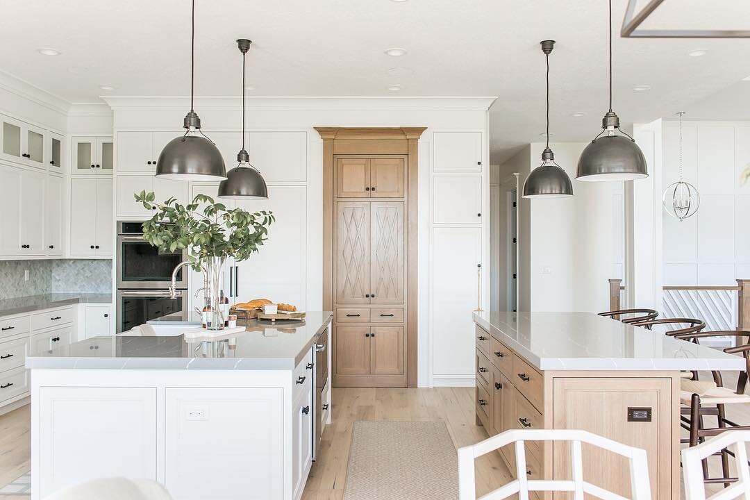
The trend toward having two kitchen islands has grown in recent years and it’s a design feature that’s become even more popular among homeowners during the pandemic.

Kitchens have become more of a focal point of the home in the past year—a space for cooking, eating, working remotely, trying out new hobbies and helping the kids with their schoolwork. Many homeowners these days need more overall counter space, but they don’t necessarily want one massive island sitting in the middle of their kitchen. For many homeowners, creating two custom kitchen islands instead of one has become a more appealing and functional design option.

Having double kitchen islands as opposed to one divides the kitchen into a socializing area and a working space. Two islands can give you more space to prepare food and gather guests in your kitchen, and it can improve the traffic patterns and flow of your space. With two kitchen islands, you also get more storage space.

Homeowners who have two islands often dedicate one solely to function—food prep—and add a dishwasher or a second sink to the island, and then reserve the second island for eating and entertaining. As you design your custom home and kitchen, consider the following when deciding between one or two kitchen islands.

1)    How big is your kitchen? The National Kitchen and Bath Association (NKBA) says an open kitchen that contains an island should have a minimum of 42 inches on each side of the island to make the space feel functional. Whether you’re planning for one island or two, consider the size of your space and what will fit without making the space feel cramped. If your kitchen is especially large, having two islands can give you more options for how to use the space. If you have a small space, it’s probably better to stick to one.

Studio M

Studio M

2)   How much do you cook and entertain? If love to cook and entertain and you spend a good amount of time in the kitchen, having two kitchen islands may well be worth the investment. One of your islands can include an area for bar stools and function as a spot for guests to keep you company and relax with a drink without getting in the way as you prepare a meal. Or, it can double as a second, more intimate dining area. If you rarely cook or have guests over and you tend to eat out more often than not, a single island might suffice.

3)   What’s your budget? When you add one island to your kitchen, you’ll need to budget for a countertop, cabinets and any appliances or fixtures you might want to add. When you have two islands, your materials increase and so do your costs. You’ll want to think about how your kitchen figures in to your overall home design and budget. Perhaps the kitchen is the most important room in the house for you. If so, it may be worth it to dedicate more money to your kitchen than others rooms by incorporating two kitchen islands into your design.

danielscottkitchens.co.uk

danielscottkitchens.co.uk

If you choose to go with two kitchen islands, you have a number of design options. Two popular layouts include parallel islands and T-shaped islands. Parallel islands tend to work best in large square kitchens, while T-shaped islands—either connected or separated by a few feet—can be a good choice for smaller spaces.

Also, think about the shape of your kitchen. For a wide and short kitchen shape, you can put two islands side by side instead of building just one long island. That way, you can cross the room in the middle, and you don’t have to go around a long 12’ island. If your kitchen is deep and long, you can put the islands parallel to each other or build them in a T-shape.

Islands also don’t have to match. One island could be open underneath to allow for stools while the other could include plenty of cabinet space. With both islands, you can add interesting accents like unique pendant lights above each and a variety of hardware.

remedy.design

remedy.design

As you plan out your custom home, you have a lot of decisions to make. For many families, the kitchen often does become the focal point of the house, so it’s worth putting some extra thought and planning time into designing the room.

At Arieli, our experience in design and building can help you figure out whether one or two kitchen islands makes the most sense for you and your family. If we discover that two islands are a better fit, our team will help you plan out how you’ll use each island, and then customize them for your family’s unique needs.

Create the most functional and best possible steam shower for your budget.

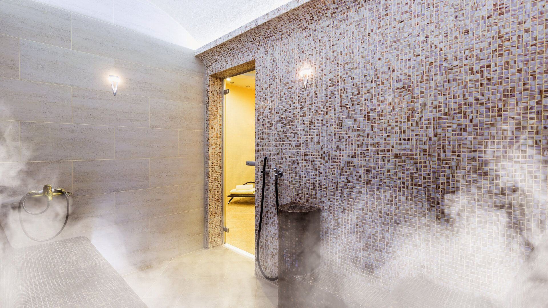
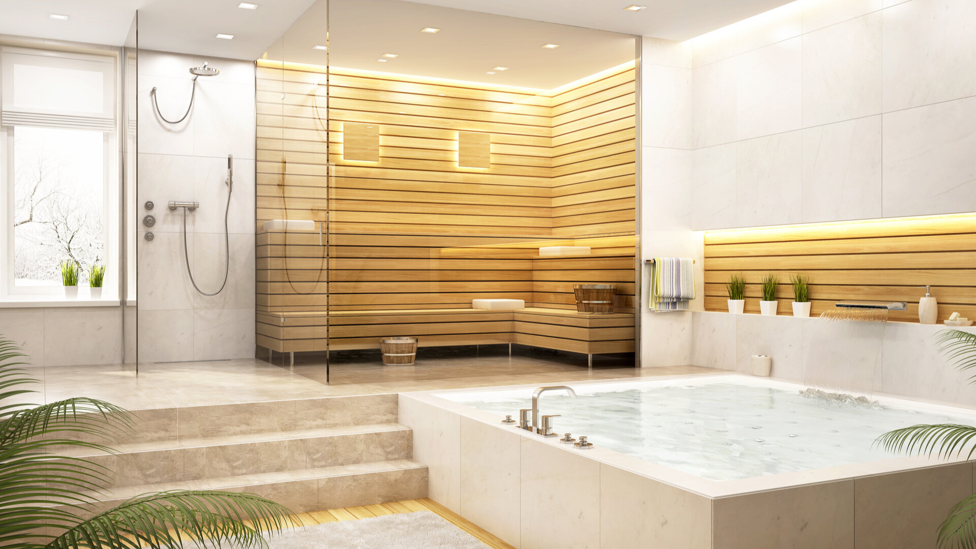
A steam shower can be a smart addition to your custom home, helping both your health and your finances. Steam rooms have been linked to health benefits including relief from sore joints and muscles, soothing allergies and reducing stress. One analysis found that houses with steam showers sell for 31% more than their expected price.

A steam shower replaces a plain shower stall, and many people opt to install one in their master bathroom. Homeowners that invest in one can create a luxury spa atmosphere at home. Steam rooms are also “green.” Steaming for 20 minutes only consumes a few gallons of water as opposed to several dozen gallons for a shower that lasts just as long.

Steam Room Arieli Custom Homes.jpg

As you plan a steam shower for your custom home, you’ll want to understand the various options and the costs involved so you can create the most functional and best possible steam shower for your budget.

1) The steam generator. A steam generator is the heart of your steam shower and can cost on average up to a few thousand dollars. Cold water pumped into the generator is heated to boiling. Then, steam flows into the shower through a steam head. More expensive models build steam faster. As you choose a generator, make sure to pick one that’s large enough to steam your space, but not too large to be wasteful. Generators can be tucked into a closet or attic space or placed beneath a bench in your shower stall.

2) Steam shower controls. To adjust steam temperature and time, you’ll need to install digital controls. Some homeowners install controls inside the shower stall, while others choose to place the controls outside the stall. Another option is to also have a remote control so you can stay seated while adjusting the temperature or setting a timer. A panel can control extras as well, like special lighting, music and aromas. Controls range in price. Higher tech ones with features like a touch screen will cost more.

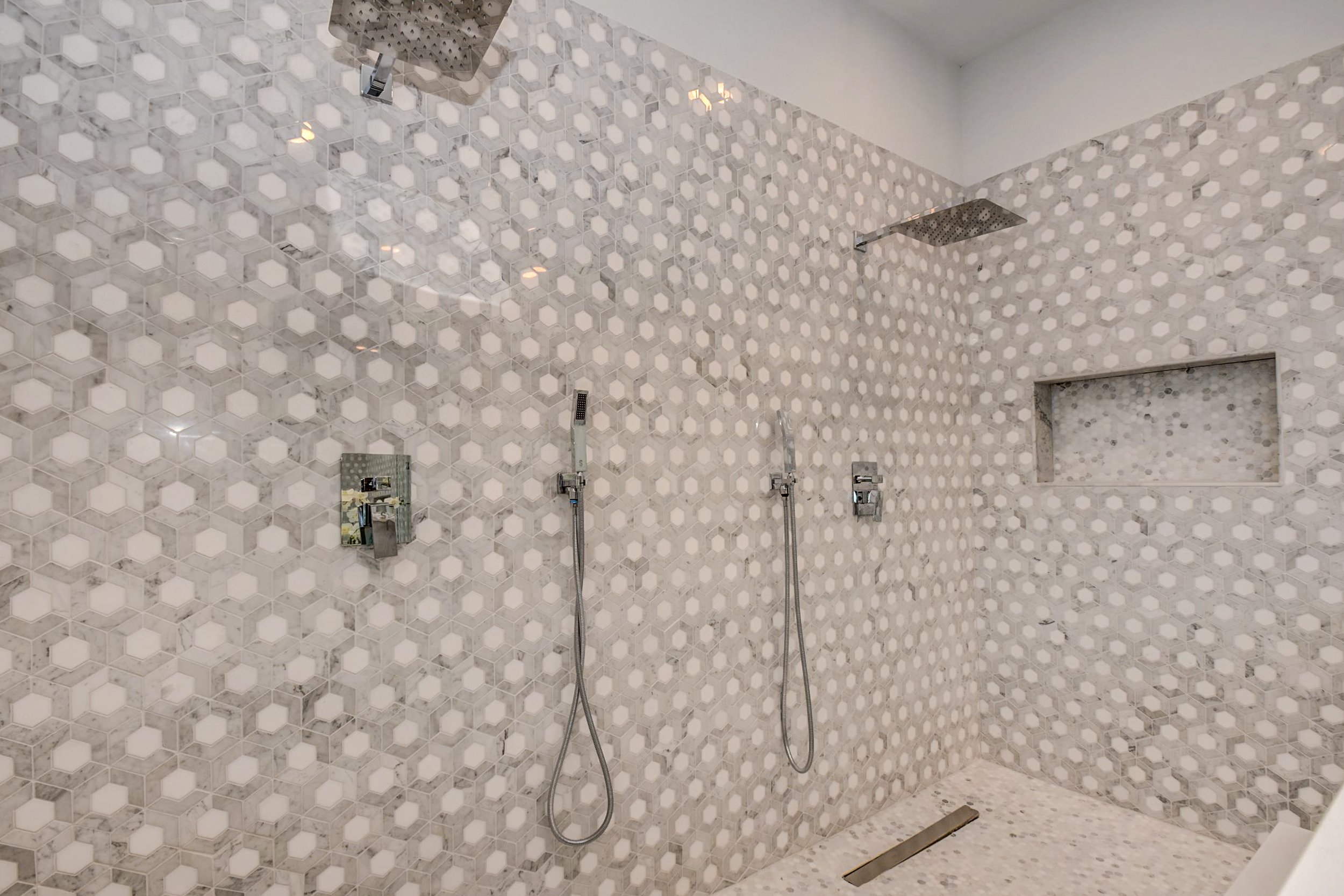
3) Tiling options. Porcelain tile is a great option for steam showers and it comes in a variety of shapes, colors and styles. Choosing the tiling for your steam shower is an opportunity to put your own unique design spin on the space. For benches, solid or composite stone is often the most comfortable to sit on. When choosing flooring, make sure to look for tiling that gets a good slip-resistance rating. Steam showers with a curved ceiling work well because water droplets can then run down the sides of the space instead of dripping straight down. For curved ceilings, smaller tiling works best.

Bench in Steam Shower Arieli Custom Homes.jpg

4) Types of benches. Some homeowners decide to install a simple bench in their steam shower, but others choose to get creative. Options include an ergonomic bench that props up your head and supports your spine, or an oversized wooden bench that can give your space a spa-like sauna feel. For smaller steam showers, a floating bench can free up floor space and often gives the illusion of a larger shower.

5) Other design elements. When building a steam shower, many people choose to use a frameless glass door to enclose the shower as opposed to a framed door. A frameless steam shower door gives the shower a more seamless and sleeker look and it can make your bathroom appear even larger than it actually is.

Steam Shower Design Arieli Custom Homes.jpg

6) Spa-like extras. Bells and whistles you can add to your steam shower include special mood lighting, Bluetooth audio so you can listen to relaxing music while steaming, and a pump to infuse calming aromatherapy oils into the shower.

In addition to buying a steam generator and the necessary parts and materials piecemeal, homeowners can also opt to purchase a steam shower kit instead. A steam shower kit can include the generator, shower tools, and the glass enclosure.

Whether you decide to opt for the a la carte option or to purchase a steam shower kit, steam shower installation should always be left to the professionals.

At Arieli, our team can work with you to design and build your ideal steam shower that you’ll enjoy for years to come.


Functional and Beautiful Aspects of a Farmhouse Kitchen

Farmhouse kitchens mimic the simpler homes of early settlers with their exposed beams and basic décor. They have a rustic, warm look and homey feel and continue to be a popular style today. With a farmhouse kitchen, you can have both a functional and beautiful space for preparing food, feeding your family and entertaining guests.

If you love farmhouse kitchens and want to create one of your own in your new custom home, the first step is to become familiar with the typical elements and materials used to create one. Classic farmhouse kitchens incorporate plenty of natural materials, including quality hardwoods like maple, oak and pine, and metal fixtures. They feature large cooking and eating surfaces, and are painted in neutral colors like beige and white.

Arieli Custom Homes Vent Hood Design.jpg

As you design and budget for your new custom home, consider the following nine typical components of a modern farmhouse kitchen and pick and choose the ones that appeal to you and fit within your unique budget.

1) Exposed beams. Exposed beams are a classic element of the traditional farmhouse kitchen. You can keep it simple with basic horizontal beams, or create a more detailed design by working exposed beams into an A-frame ceiling.

2) A large, natural butcher block. Most farmhouse kitchen feature a sizable butcher block countertop that gives you plenty of space for food prep. Butcher blocks give a kitchen a clean, simple look and are also inexpensive, convenient since you can use it as a cutting board, and easy to maintain. For added storage space, opening shelving can be added below the countertop to give a decorative touch to the space.

3) A kitchen farmhouse sink. These types of sinks, also often called apron-front sinks, have become more popular in recent years for their sleek look and functionality. Farmhouse sinks are wide and deep and can hold a good number of dishes. While there are new models to choose from, you can also find attractive vintage models.

Arieli Custom Homes Kitchen Remodel.jpg

4) An exceptional stove. In old-time farmhouse kitchens, the stove was the centerpiece of the room, and often of the entire home, providing warmth and nourishment. Some modern homeowners who’ve committed to a classic farmhouse kitchen choose to invest in antique or vintage stoves to complete the rustic look.

5) Stone or hardwood floors. Farmhouse kitchens incorporate natural elements throughout, but definitely in the flooring. Most modern farmhouse kitchens have wooden floors with wide planks, imperfections or graining and natural or matte finishes. Other homeowners opt for more rustic stone flooring made from a material like slate or limestone. Wooden and stone floors are also relatively easy to clean and maintain.

Arieli Custom Homes House.JPG

6) Custom farmhouse kitchen cabinets. Farmhouse kitchen often include a mix of open shelving with kitchen cabinets, which can make your space feel larger. Custom cabinets in a classic farmhouse kitchen should be simply designed, with clean lines, plain trim and paneling. They’re often made from reclaimed, salvaged or distressed wood, adding to the room’s rustic look. Cabinet hardware in farmhouse kitchens could be antique, with a simple look. Beadboard is also often used on cabinets, walls and even on ceilings to bring additional texture into the room.

7) A hanging pot rack. Pot racks became less popular as built-in kitchen cabinets became more prevalent. But, in recent years, and especially in farmhouse kitchens, they’ve grown in popularity. Hanging pot racks make a kitchen more functional because it’s simple to grab the pot you need rather than digging through a cabinet. A preferred spot for a pot rack is above a kitchen island or butcherblock.

8) A banquet-style kitchen table. Called a farmhouse table, this type of kitchen table is usually large, rectangular and made from natural wood and it can seat more than a family of four, usually up to eight or ten people. The table harkens back to when people lived on farms and had larger families to accommodate around the table. Today’s often smaller families can use it for both every use and to entertain guests.

Arilei Custom Homes Lighting Desing.jpg

9) Versatile, interesting lighting. Old-time farmhouse kitchens had large windows and plenty of natural light to brighten the room during the day. Modern farmhouse kitchens can mimic that with large, abundant windows, while also making use of recessed lighting and simple metal fixtures like wall sconces and pendants made out of wrought iron or even copper.

As you plan for your modern farmhouse kitchen, balance out the functional elements with the beautiful ones keeping your budget in mind—and get creative. Farmhouse kitchens are all about a homespun and handcrafted feel, so don’t be afraid to put your personal touch on the space, whether it’s by adding an old-fashioned hutch from an antique shop, incorporating exposed brick, or creating a custom apron rack.

At Arieli, we have years of experience designing and building beautiful farmhouse kitchens. Please find more information on building a custom home with us here.

Open Kitchen Shelving. How much is too much?

Open kitchen shelving can be a great addition to your custom home kitchen, adding warmth and style to your space and making it easier to access items you use every day.

Open shelving is a trend that’s been around for years, and homeowners still love the look. Many people realize they’re cooking or using special kitchen items more often when they’re on display. They also like switching up how their kitchen looks by the season—for example, displaying mugs and soup bowls in winter and more glassware and plates in summer. When basic items are displayed, guests don’t have to ask where to find dishes, and emptying the dishwasher is easier. Some families find open shelving is ideal for family members who can’t remember to shut kitchen cabinets.

Yet, at the same time, if you fill your entire kitchen with open shelving only, your space could end up feeling cluttered and be less functional. When thinking about how to design your custom home kitchen and keep it well organized, it’s a good idea to strike a balance between open shelving and traditional cabinet space.

Configuring your space

The right mix of open shelving to cabinet space will depend on a variety of factors, including the size and shape of your room. For small or dark spaces, adding more open shelving than cabinets can make the kitchen feel bigger and brighter.

Generally, a good balance is to have 20-30% of your kitchen as open shelving and the rest as traditional cabinets. Shelving works well, especially, in narrow parts of the kitchen or spots where cabinet doors would bump into each other.

Open shelves can be dedicated to beautiful items you want to display, while cabinet space can be left to older, clunkier items. Some homeowners choose a focal point in the kitchen to dedicate to open shelving, while creating cabinets in all other areas.

Final-8.jpg

In recent years, using open kitchen shelving where top cabinets would normally go has become a popular trend since it gives the room a more open feel. Homeowners also like to use open shelving above their kitchen sink—where cups can be stored—and near the stove—where spices and pantry staples can be displayed in clear jars.

Other popular items to store on open shelving in the kitchen include everyday plates and bowls, mugs, mixing bowls, and even small appliances. Some homeowners like to add cookbooks, vases or potted plants to add interesting visual elements to the room.

For lower kitchen cabinets, most people prefer to keep them closed off. However, adding in some open shelving on a kitchen island can be an attractive accent.

When you’re deciding on the right balance of open kitchen shelving and cabinets, keep the following three considerations mind:

1) Take a kitchen inventory. Think about every item in your kitchen. You may even want to make a list to make it easier to visualize. Which items would you want to display, and which would you prefer to hide away. What’s that ratio like? Remember that you can pack more into closed cabinets since they offer better support and they’re out of sight.

2) Think about pets. If you have curious, agile cats, for example, storing your best China on a lower hanging—or even a higher—open shelf could be problematic. Pet hair or dander from both cats and dogs is also more likely to collect on items that are stored out in the open.

3) Plan for extra cleaning. Dishes and other items stored on open kitchen shelves can not only collect pet hair and dander, but also dust and even grease from cooking. If you’re planning to store everyday items on your open shelves, extra cleaning should be minimal. However, if you’re storing less frequently used items, you’ll want to dust or wipe them down regularly. Dishes that have been splattered with grease could require some extra cleaning.

After considering these factors, if you’re still not quite sure about the right balance of open shelving to cabinets for your custom home kitchen, at Arieli, we can help. We work with our team of architects and designers to come up with a plan that’s perfect for your custom space and your unique needs and budget considerations.

If you’re renovating your current home, a great way to experiment with open kitchen shelving before taking the plunge is to remove existing cabinet doors for a couple weeks. Then, see how you like the new aesthetic. If you like the look, and you can keep your space looking sleek and uncluttered, then you can permanently convert some of your cabinets to open shelving.

Do you want separate closets or one shared space with an island?

When you build a custom home, you make every space your own, from the entry way to the pantry to your master bedroom closet. Out of all the decisions you’ll make as you’re designing your custom home, an important one is how you’ll configure your master closet. Do you want separate closets or one shared space with an island?

It’s a good idea to think carefully about your master bedroom closet since it’s a spot you’ll spend a good deal of time in each day. In recent years, plenty of well-planned-out storage space has also topped homebuyers’ wish lists, so a solid closet design can help with resale value as well—should you eventually decide to sell your custom home.

There are both pros and cons to having separate closets and a single shared space with an island. The best way to decide is to think about your particular situation, your needs, your budget, and how you want to use your closet space day to day.

Sticking to separate closets

Separate closets can work well if one person has significantly more “stuff” to store than the other. In that situation, the person with fewer clothes might feel overcrowded in a shared closet and could feel happier if they were to have their own personal space.

If the person you’re sharing a closet with has different ideas about tidiness than you do—they’re typically messy while you like a clean closet—sticking to separate spaces can also help stave off arguments or any feelings of resentment.

Arieli Custom Homes Windows in Master Closet.jpg

Separate closets provide more privacy as well ,and they can be a more convenient and less hectic option first thing in the morning when you’re rushing to get ready for work. Having individual closets means that you’re not getting in each other’s way while you’re trying to choose your outfit for the day.

Committing to a shared space

In recent years, however, more and more homes have featured walk-in master bedroom closets as many homeowners have gravitated toward larger closet spaces with a more open feel.

In kitchens, islands can add important extra storage space. It’s the same with closets. Having a shared walk-in closet with an island can add to your storage options, giving you custom-made spots to stash your shoes, belts, and even your jewelry.

Many homeowners like closet islands because they can eliminate the need for a dresser or a bureau, freeing up space in the master bedroom and giving your bedroom a cleaner, more streamlined feel. A closet island can also come in handy as a space for folding clothes or packing luggage as you’re preparing for a trip.

Arieli Custom Homes Island in Master Closet.jpg

For a shared closet with an island, you need a large enough space so the closet doesn’t end up feeling cluttered. Generally, islands work well when they have around 36 inches of space on each side. That translates into a closet space that’s at least 12’ by 12’.

Adding an island to your share closed is also another opportunity to put your design spin on your space. You can choose an interesting finish for your island or top it with an eye-catching granite or a marble slab. Choosing interesting decorative hardware can also make your custom master closet island stand out.

Closet considerations

As you mull over whether to have separate closets or a shared space with an island, it’s a good idea to start by taking an inventory of what items each person has in their wardrobe and needs to store. Think about how much clothing should be hanging — and which items need a full hanging space versus a half space. Also think about what items can be placed in drawers or set on shelves instead.

1971-Arieli-4902 Jason-059-web.jpg

Islands with drawers and dividers can be great for folded items like T-shirts, pants, underwear and lingerie and scarves. In the past year, many people have found themselves buying and wearing more leisure attire, which lends itself well to storage in drawers and on shelves.

With many workplaces now permanently shifting to at least part-time remote work for their employees, for many people, this trend toward more leisure wear could stick. Consider this as you’re making decisions about your custom closet.

Finally, think about how your closet could work in conjunction with other spaces in your new home, like your laundry room. If you decide to have a larger, shared closet, you may also have room for a hidden ironing board so you can do a fast touch-up before getting dressed. An island can also be built with a pull-out hamper inside. 

Whichever you choose – separate closets or a larger, single space with an island – take the time to work with your architect and custom builder team to make sure the final design suits all of your needs. At Arieli Homes, we’ve designed countless custom master closets. We love working with our clients to find the solution that best fits their unique needs.

Which microwave to choose and why

As you’re planning out your new kitchen, you might be wondering if microwaves are out of style. You may ask yourself, should I get a microwave for my new home? The answer—you probably should.

Ever since microwave ovens were invented in the late 1940s, they’ve stood the test of time. Microwaves continue to be a staple in U.S. households and an essential kitchen appliance in our modern and fast lifestyle. It’s a quick way to re-heat leftovers, melt butter or chocolate, steam veggies, and even cook full meals. These days, go online and you’ll find tons of interesting recipes that can only be made in the microwave.

Still, even though most of us can’t imagine our kitchen without a microwave, it’s an awkward appliance. Designers continue to struggle to find a good spot for a microwave in the modern kitchen regardless of the model. Some spots are just hard to reach, make microwaves difficult to clean, and can feel unsafe for some homeowners.

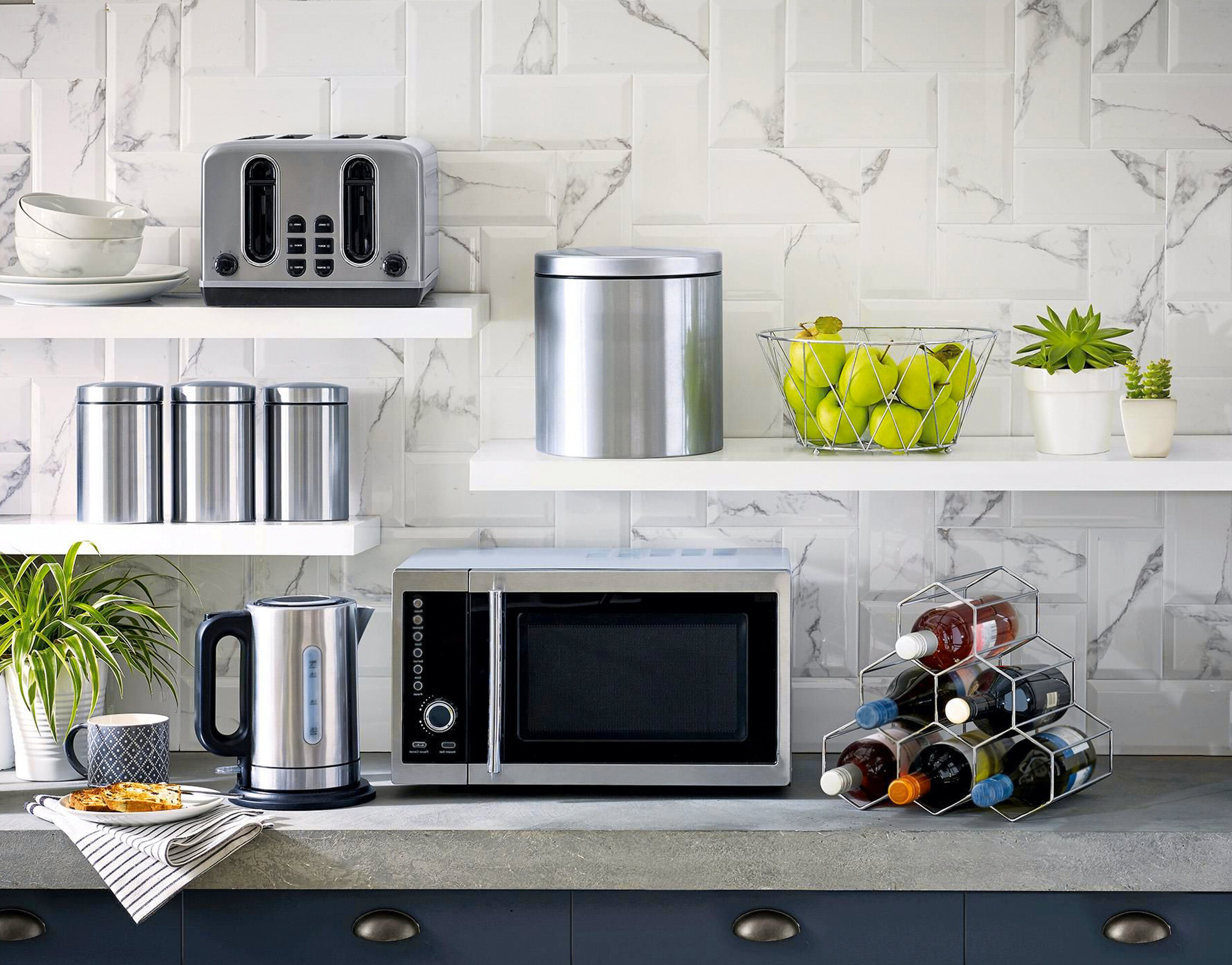
Currently, there are four types of microwave ovens on the market: over-the-range, countertop, built-in, and drawer. Some of these models also come in a convection option. Unlike a standard microwave, which uses radio frequency to cook food, a convection microwave oven cooks with heating rods and a fan that circulates air in the oven, keeping food moister and more flavorful.

All microwave oven models have their advantages and disadvantages. Your kitchen floor plan, design style, your preferences and requirements will dictate the right microwave type for your new home.

Over Range Microwave.jpg

Over-the-range microwaves. These types of microwave ovens install above a range or a cooktop in place of a range hood.

Pros

·       Great for small kitchens, saves space

·       Functions as a vent, two appliances in one

·       Built-in lights brighten the surface of the range or cooktop

·       A convection oven option is available

Cons

·       Too high for some people to lift heavy dishes inside, including kids

·       Provides poor ventilation (usually 300 cfm capacity, like a basic vent hood)

·       Accumulates built-up grease from the range burners below

Counter Microwave.jpg

Countertop microwaves. These standard freestanding microwaves are designed to be placed directly on your kitchen counter.

Pros

·       Easy to move

·       Inexpensive

·       No installation needed

·       Easy to see inside and reach to clean

·       Convection cooking option is available

Cons

·       Takes up valuable countertop space (about 4 square feet of counter)

·       Take away from a kitchen design, does not look sleek or appealing


Built-In Microwave.jpg

Built-in ovens. This type of microwave is installed into a cabinet or a wall.

Pros

·       Frees up counter space

·       An integrated design that looks sleek, luxurious

·       Custom height; the appliance can be installed at your eye level

·       Convection cooking option is available

Cons

·       Professional installation is recommended, which drives up cost

·       Difficult to replace

·       Takes up valuable cabinet storage space

Misterio Quartz Kitchen Island.jpg

Drawer Microwave. A microwave drawer is designed to fit perfectly into a lower cabinet or inside a kitchen island.

Pros

·       Gives you additional countertop space

·       Provides a modern look

·       Has a spacious interior

·       Easier reach for people who are shorter, including kids

Cons

·       Convection cooking option is currently not available

·       Professional installation is recommended, which drives up cost

·       Hard to reach for cleaning the interior back wall

·       Takes up valuable cabinet storage space

·       Requires bending down to see the controls

·       Difficult to replace

When you’re shopping around for a microwave oven for your new kitchen, there’s no wrong choice. Microwave drawers are a very versatile option for modern cooking needs. Along with built-ins, microwave drawers are also probably the best option if you want a sleek and streamlined look in your new space.

But if you’re on a tight budget, or you have a small kitchen with limited cabinet storage space, it could make more sense to install an over-the-range microwave or go with a countertop one. Whatever you choose, to extend your microwave’s life and avoid unnecessary repair expenses, be diligent about covering your food while heating it up, and always keep your unit clean.

Follow these tips to save money on your new build. Learn where to cut and compromise when building your home!

A fancy bathtub, kitchen tiles sourced from Italy, a wraparound porch. As you’re planning your new, custom build, it’s normal to be excited about all the possibilities—the special features and finishes you’ve always wanted in your dream home.

Why showers are replacing tubs

But often, budgets are limited. Some busy future homeowners also want to help customize and personalize their home by choosing the features and finishes themselves. That takes time, however, and will likely add to the length of the project as the number of features continues to grow and the homeowner struggles to find time.
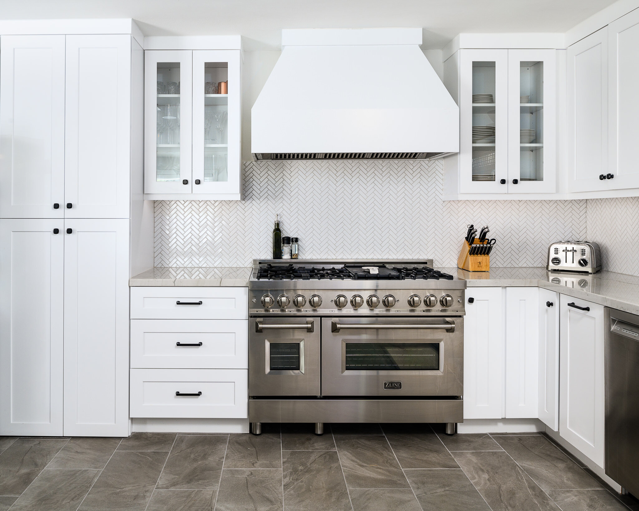
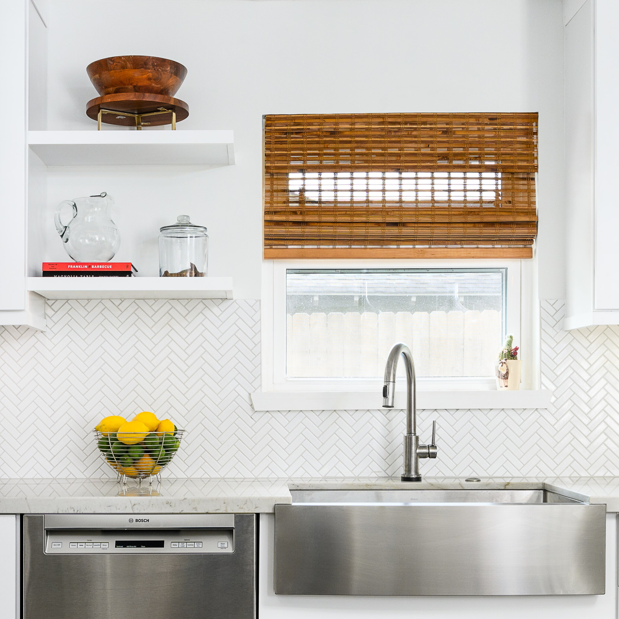
With custom home builds, it’s okay not to have it all. To make your project less stressful and more pleasant, it helps to decide which features you can’t live without and which you can compromise on. Some homeowners find only after they’ve completed a build that they included items they rarely use. Think about your needs, and current and anticipated future lifestyle, as you plan your project. Setting realistic goals that include possible compromises and cuts also helps to reduce overconsumption and protects the planet.

Cozy Office ideas.JPG

Our Imogene Project

Consider these top six types of compromises and cuts that can be made during planning and construction of new home builds:

1. Forgo a tub in the master bath. A big, freestanding bathtub can be a nice focal point in a master bath, but in recent years some homeowners have decided to leave out a tub in the master bath and instead use the space for a shower. Not including a tub can save both money and time spent agonizing over the right tub.

2. Saving items for future installation. Maybe you want a pool or an elevator installed in your custom build, but you just don’t have the funds. The groundwork can be laid for items like pools and elevators during your build, making it less expensive for you to complete the installation down the road.

Building a pool in a flood zone?

3. Think about rooms you can combine. Some homeowners choose to combine rooms they don’t use all the time to cut down on costs. For example, if you don’t frequently have guests who stay with you, you could combine a guest room with an office. Other homeowners have paired their dining room with a library.

4. Ditch the porch. Porches in Houston, where temperatures can top 100 degrees in summer, are more often than not designed for a particular look and are infrequently used, especially on the front of the house. On a tight budget? Consider forgoing a porch.

How Much Does It Cost to Convert Windows to a Patio Door?

5. Reconsider sky-high ceilings. High ceilings look and feel great. They can open up rooms and researchers have found they just make us feel good. But they also cost more to build and they can cause heating and cooling costs to add up.

6. Scale back the size of your kitchen island. Kitchen islands can help your kitchen flow and provide a great space for food prep. The average kitchen island measures at about 3 feet deep by 6 ½ feet long. Some people like to have even bigger islands, but those over 5 feet deep are just too large to efficiently use or clean. Creating a large island for your kitchen also adds a good deal to building costs.

Double Kitchen Islands. A Trend Not Going Anywhere

As you’re planning and executing your custom home build, keep in mind these six compromises and cuts. If you find yourself nearing the end of your budget or you’re too busy to take the time to browse all the features and finishes you might want, consider scaling back, at least for now. It’s okay not to have it all, and you can always add additional features later.


You May Also Like: